I am Ganga Bhavani or simply Ganga. After struggling through a series of failures, finally my website is done. But I just like the process of learning how to do it.
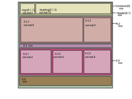
After getting the mock design I boxified i.e traced out all the various boxes - container and contained boxes.After that I have assigned a grid class to each box based on the space it seems to have been occupying on the mock design.I have used place holder images from placehold.it website and made them responsive with the help of image-responsive class. I used Lato on Google webfonts as instructed in the lesson.
I started testing the website in chrome web developer tools. There were some issues with the heading and the images with the former running into two lines crossing the horizontal rule on phones(Extra-small devices as defined by Bootstrap) and the latter looking bad on small devices(768-991) with them just stacking one upon eachother and leaving a lot of free space beside them. I resolved the first by styling the h1 and h4 tags according to the screen size using media queries.I also included grid classes for small devices to resolve the issue with images. Later h1 ran into two lines on extra-small devices. I resolved this by hiding the logo image.
The most time taking and the stupidest mistake is assigning a grid class 6 on medium devices outside the associated aticle. While image has a fixed height the text ran into a larger column resulting in two uneven columns. I resolved it finally by including image in the article.